Print on Print
On my last trip to LA for my best friend’s wedding, I received many compliments on the outfit I wore to the rehearsal dinner – “I love your print on print!” the ladies said to me repeatedly. I was indeed wearing 'print on print', but I hadn't realised there was a term for my combination. I paired Zara pants – navy with a white and orange diamond print – with a top I bought in Milan, which was orange with a small blue and white diamond print. They weren’t the same print, but there were enough similarities in the colours and patterns for them to match. It was a bit of an 'outside the box' outfit, but it clearly worked. When I wear that combo in Australia, I get the same reaction.

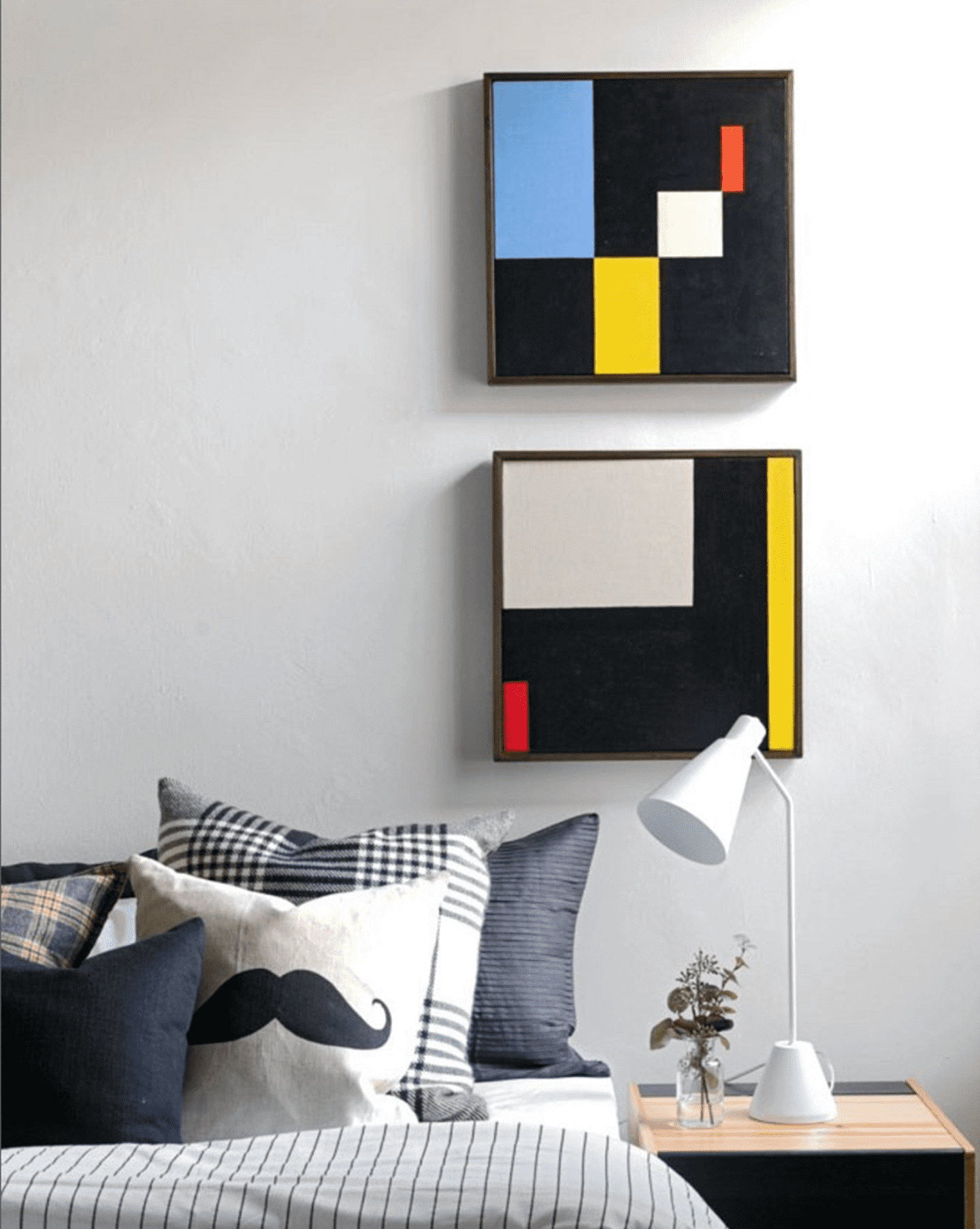
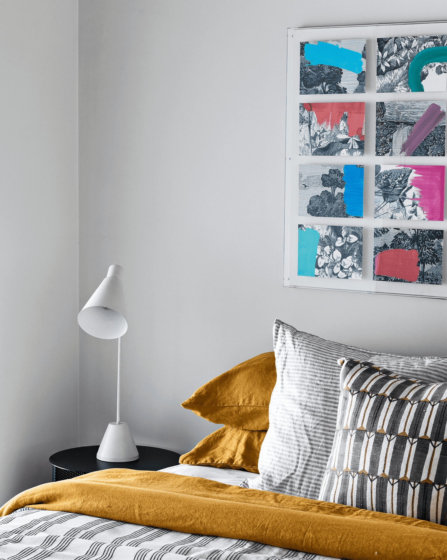
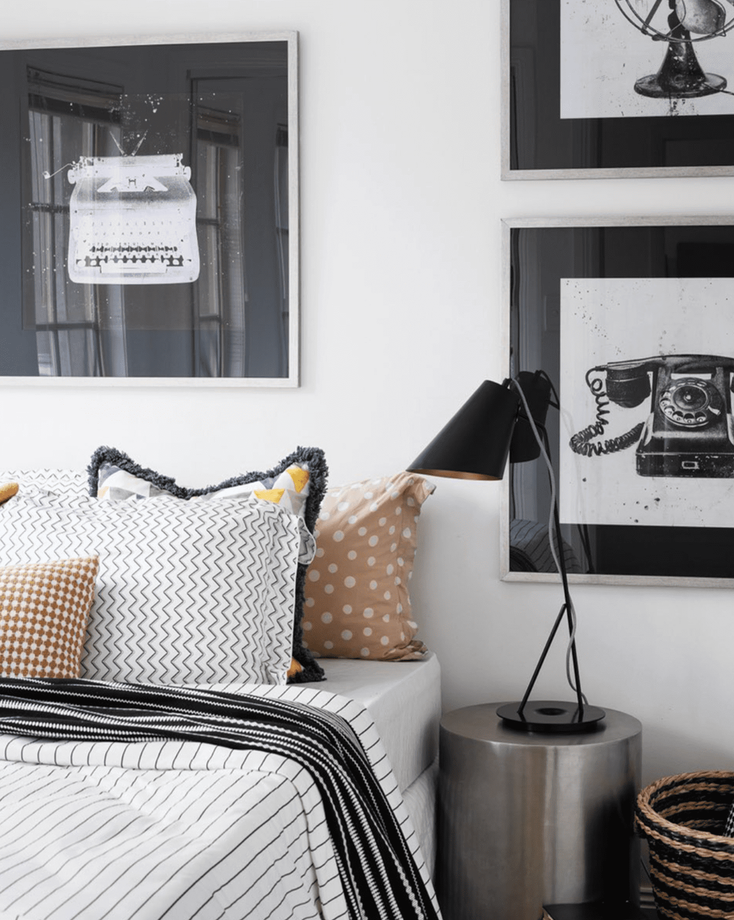
Print on print translates really well to interiors too. Your bed is a perfect starting point for your print on print adventure. There’s a fine line between clashing and complementing, so put a little thought into it and avoid just throwing together whatever you grab from the cupboard.
For the concept to work successfully, there needs to be something that ties the prints together, like the tone of the print and/or the pattern itself. Sometimes the thing that ties the prints together is less obvious and can – by left-brain standards – appear to clash rather than complement. But if you follow some of these simple rules, you too can successfully play with prints.
I like stripes with stripes, for example. However, when combining these prints, I focus on having just one bold stripe, and the other (or others, if you’re combining more than two prints) a subtle stripe. This way, the strong stripe pops while the subtle stripe recedes. It’s also worth noting that you can introduce additional prints into this mix – and remember that solids can help break things up a little; it doesn’t have to be all prints if you’re mixing in multiple textiles.
When it comes to mixing patterns, size matters. On a large scale, a very small print – regardless of what it depicts – tends to read as a solid, especially when mixed with other larger prints that dominate and dwarf the smaller one. In this case, you can be both bold and subtle at the same time by choosing one print as your base textile and the other as the accent.
A check and a floral, for example, can pair beautifully. It can be a bold flower with a subtle check, or a subtle check with a bold flower. If your floral has a black background, a black and white check would work brilliantly.
Bold and bold work too – if you dare to be so bold – just remember there should be a link between the fabrics. They can even be the same print in different colourways – or even the same colourway, like the matching twin 'PJ' sets you see on the streets and in shop windows these days.
Hey, life is short, right? Why not make it memorable, like the queen herself, Iris Apfel. RIP.
https://www.homestolove.com.au/decorating/iris-apfel-interior-style-18925/